Blog
Insights from the digital edge
-

What is a composable DXP?
Composable DXP is often presented as a modular digital platform enabling companies to select and assemble different specialized solutions to create a tailor-made suite. Powered by APIs and microservices, it promises total flexibility by integrating tools from a variety of suppliers, according to the specific needs of each organization. In theory, this approach sounds ideal: instead of being locked...
-

How to Make a Website Accessible: Guidelines, Design Practices, and Compliance Strategies
Learn how to make your website accessible by following web accessibility guidelines, adopting inclusive design practices, and achieving WCAG compliance.
-

Best accessibility testing tools for web applications
Testing the accessibility of your web sites is usually the first step before starting any compliance work. Here are 12 tools to help you.
-

DXP vs CMS: Which is right for you?
Your teams are managing complex digital environments: multiple websites, internal portals, multilingual content. Sound familiar? The pressure to deliver seamless, secure, and personalized experiences has never been higher. You’re likely asking: Is a CMS enough or is it time for a DXP? According to Statista, global spending on digital transformation including technologies like DXPs is expected to reach...
-
.jpg?t=w540)
Top 8 alternatives to Liferay in 2025
Liferay is a popular solution on the Digital Experience Platforms (DXP) market, not least because of its modularity and open-source approach. It enables companies to build customized web portals and intranets with multisite and multilingual capabilities. But the solution can quickly prove cumbersome to deploy and complex to administer. Between hidden costs, high technical requirements and the need...
-
.jpg?t=w540)
How to Choose a Digital Experience Platform (DXP)?
Today's customers expect more than just a basic website. They want personalised, seamless experiences no matter how they interact with your brand. This is why choosing the right digital experience platform (DXP) is so important. The DXP you select will determine how well you can connect with customers across all your digital channels. DXP is like a set of tools bundled together that helps you create,...
-

What is your customer experience ecosystem?
In a world where customer loyalty is hard-won and easily lost, businesses must think beyond individual touchpoints and instead focus on the entire customer experience (CX) ecosystem. A well-orchestrated CX ecosystem ensures that every interaction a customer has with your brand whether through a website, social media, support channels, or in-person is seamless, personalized, and memorable. This article...
-

How to design a digital customer experience strategy
Discover how to improve digital customer experience with effective strategies. Learn to design a digital CX strategy that enhances accessibility and builds customer loyalty.
-

Digital asset management vs document management
Discover the difference between DAM and DMS. Learn how these tools streamline digital content management to organize creative assets or critical business documents.
-

Static vs. dynamic websites: here's the difference
Discover the difference between static and dynamic websites, their pros, cons, and how our DXP solution can enhance your digital presence.
-

What is Enterprise Web Development?
Discover what an enterprise website is and explore examples. Learn how enterprise web development empowers your business with tools to stay competitive and drive growth.
-

What is Content as a Service (CaaS)?
Content as a Service (CaaS) helps businesses deliver consistent, personalized content across all platforms. Discover how CaaS can enhance your content management.
-

AI, SEO & Content Marketing: analysis by Karine Abbou
Explore SEO 2025 trends and discover how to adapt your content strategy to the age of generative AI with Karine Abbou's analysis.
-

What is the content lifecycle?
Content lifecycle management covers all stages from creation to deletion. Learn how different content types, like white papers and videos, follow unique processes for each phase.
-

What is Content Architecture and Why Does it Matter?
Content architecture is key to efficient content management systems. Learn how it enhances engagement, scalability, and drives success. Read the full article to know more.
-

10 Effective Ways to Enhance Web Accessibility
Learn how to make a website accessible with best practices and features. Discover 10 ways to enhance web accessibility and create an inclusive online experience for everyone.
-

What is a Cloud CMS? Everything You Need to Know
Discover what a Cloud CMS is and how it transforms content management. Explore its benefits and learn how to optimize your digital strategy for the future.
-

CMS replatforming: strategies, project phases and benefits
Discover the strategies, project phasing and main benefits of a successful CMS replatforming project. Reducing the number of legacy CMS platforms provides huge benefits to large organizations.
-

Software Security: Best Practices for Securing CMS
Learn about software security types and examples, and discover 5 best practices for securing your CMS, protecting sensitive data, and preventing cyberattacks.
-

AEM alternative : why developers and architects should consider Jahia
Looking for an alternative to AEM (Adobe Experience Manager)? Here is a quick summary describing the tech behind Jahia.
-
AI: what you need to know before setting up a PoC
So we went along to the Gartner Symposium, to get the analyst's latest technology recommendations. The topic at the heart of the debate? AI.
-
Choosing the Best Multilingual CMS
Choosing the best multilingual CMS is not an easy thing to do. So here is a list of checks to make before making you choice. Jahia CMS offers advanced features for managing multiple languages and is used by international businesses and NGOs to serve websites in several dozen languages.
-

Playbook: 3 steps to integrate AI into your CMS
We've gathered the words of experts to offer you a relevant approach to integrating AI into your CMS.
-

CMS Security: Why It's Crucial for Your Business
CMS security is vital to secure your content management system, protect business data, and defend against cyber threats. Read the blog to learn how to safeguard your business.
-

Why is there no enterprise Java CMS based on Spring Framework or Spring Boot?
Introduction Spring framework is fantastic. Most Java developers work with it at some point, and they all enjoy it. Spring provides good dependency injection and many other libraries/tooling (Spring Security, Spring Batch, Spring Boot, ..) to solve the typical problems developers face. That said, when building a platform, Spring has important limitations, and they cannot be ignored or avoided. Most...
-

Using Digital Asset Management Integrations
Digital Asset Management (DAM) integrations enhance your CMS platform. Learn how using integrations can streamline workflows, boost efficiency, and improve team collaboration.
-

Headless Java CMS: In depth guide for developers
For Java Developers: what you should really look into when evaluating a headless Java CMS.
-
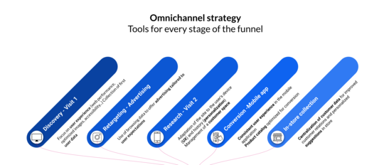
Tools for an evergreen omnichannel strategy
Adopting an omnichannel strategy relies on well-integrated tools that enable fluid content and data management. Jahia combines a flexible CMS, a Customer Data Platform (CDP), and bi-directional connectors for a unified, scalable experience, offering a balanced alternative between software suite and modular stack.
-
Create a website with JavaScript thanks to the new front-end stack in Jahia 8.2
Press Release Geneva, Switzerland – Jahia Solutions Group, the open-source digital experience platform (DXP) pioneer, has officially launched Jahia 8.2.0, a major update to its flagship product. This latest version introduces groundbreaking innovations, particularly with JavaScript modules, designed to enhance front-end development and streamline the creation of dynamic digital experiences. With Jahia...
-

Cloud CMS: 3 points of attention for your migration
Migrating a website or Enterprise web portal from on-premise hosting to Cloud hosting requires more than just a few clicks and some patience. It's not just a matter of transferring data from one box to another, but of adapting a web infrastructure to the structure of the cloud. The original process was to export the site via the administration interface, which turned out to be completely impossible...
-

Jahia's Portal Management Guide
Jahia’s portal management system is built on the open source, digital experience (DXP) platform. This headless CMS environment makes managing portals simple.
-
User-friendly JavaScript & Java CMS : discover Jahia 8.2
Avec la version 8.2 de Jahia, le marché des CMS et DXP voit arriver une solution pensée à la fois pour les développeurs et les contributeurs.
-

CMS with cloud hosting: what monitoring tools are needed?
Discover the tracking and monitoring possibilities available in a cloud-hosted CMS, and the role of monitoring in optimized performance and user experience management.
-

Web projects team: which skills to recruit?
Identify the essential skills you need to recruit for a successful web project: digital strategy, UX/UI design, content & SEO, security... But above all, web development.
-
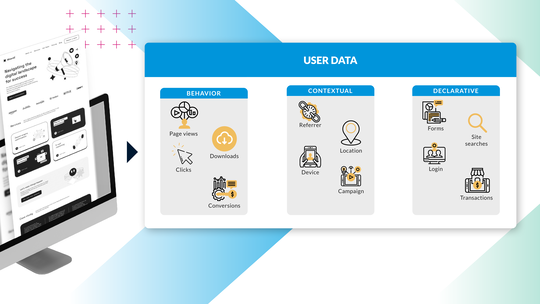
Conversion: 3 essential steps in your Personalization Strategy
63% of digital marketers report that they struggle with personalization (Gartner). In this post, I’ll walk you through how to achieve meaningful personalization at scale.
-

What is a Headless CMS? The true Headless CMS definition
A Content Management System (CMS) can be used in headless or traditional mode. In our article that explains how these two modes work, you will discover the limitations of each method depending on the structure of your company.
-

4 steps to personalize your customers' web journey
Jeff Bezos said "If you build a great experience, customers tell each other about that. Word of mouth is very powerful." This means that a bad experience can hurt your brand image and drive customers to your competitors. Personalizing your customers' experience by offering them content adapted to their needs is essential to capturing their attention and increasing conversion and engagement. What is...
-

Internal search engine: 4 best practices to improve your visitors' web experience
If user experience is an important factor in your digital strategy, then having a performant search engine on your website or your web portal is essential. The people who use the search engine on your website are : In the position where they already know exactly what they are looking for, or in the position where they have not found sufficient information during the navigation and want to learn more. ...
-

Create a digital experience with your CMS
Digital Experience: Transform your website into an interactive, personalized tool. Give your users a unique experience thanks to your CMS.
-

FTR : Jahia reaffirms its security commitments with Amazon Web Service (AWS)
With the Foundational Technical Review, Jahia Solutions takes another step forward in its collaboration with Amazon Web Services, and reaffirms its security commitments.
-

Performance of you website: your images weigh heavily
When it comes to website performance and optimization, the weight or size of images is what comes most naturally to mind: the lighter the images, the faster your pages will load, the better your users' browsing experience will be, and your search engine positioning with it. Our partner Scaleflex, which offers a specialized solution on the subject, has agreed to give us a few pointers to help you optimize your website's performance.
-

Boost your SEO performance with direct access to Semji in your CMS
Jahia is based on a framework that enables organizations to create sites optimized for technical SEO. Our partnership with Semji gives you access to a powerful tool for boosting your semantic SEO.
-

Keepicker: a DAM integrated into your CMS for better content management
The Keepeek DAM is now part of the Jahia digital ecosystem: a high-performance solution that will make it even easier to manage content in your CMS.
-

Open Source CMS: What is it and do I need it?
In this post, we’ll examine what an open source CMS is, how it works, and who can benefit from the software the most.
-

What is a web portal? (Update 2025)
From the Intranet to the extranet, the web portal has established itself as a leading online tool for companies in all sectors. But it's not always easy to define exactly what this term means.
-

Why opt for a B2B customer portal? The benefits and challenges for your company
Social networks, online research, more direct relationships with customers: B2B commerce is evolving. Professional buyers are looking for a user-friendly, personalized experience, and attach great importance to the responsiveness and availability of online information. The freedom and convenience provided by an ordering portal have become essential differentiation criteria for remaining competitive...
-

The supplier portal: how it boosts your productivity and strengthens your business relationships
E-procurement, e-sourcing, e-invoicing... Relations between service providers and customers are evolving and becoming increasingly digital! Performance, flexibility and simplification are imperatives. At the heart of this movement, one tool is proving to be essential: the supplier portal. This collaborative platform offers numerous advantages, including data centralization, process standardization...
-

Self-service Portal: what you need to know before launching your strategy
Self-service web portals are adopted by more and more companies. But what exactly is a self-service portal, and what are the key elements to consider before launching your strategy?
-

How to Choose the Optimal Platform to Build Your Online Portal: A Comprehensive Guide
In today’s digital business landscape, a successful web portal, or user interface, depends on its foundational platform. There are many options and providers to choose from which makes identifying a portal platform that aligns with your organization’s vision and requirements that much more important. This guide will help explore crucial considerations such as compatibility, ease of use, scalability,...
-

Hybrid CMS Benefits for Content Management: Merging the Best of Both Systems
Navigating between content management systems (CMS) can be complex. The debate between traditional, headless, and hybrid CMS continues, with each offering unique benefits. However, the hybrid CMS stands out as a blend of the best features of its counterparts by merging the ease of use of a traditional CMS with the flexible, future-proof architecture of headless systems. Presenting lower startup costs...
-

Advantages of Headless Enterprise CMS for multisite applications
Choosing the right content management system (CMS) can significantly impact your organization’s digital presence. Jahia, a pioneer in both traditional and headless CMS, has proven experience as an optimal choice for enterprise businesses seeking a balance between flexibility, functionality, and user-friendly design. In this article, we'll review Jahia's capabilities aligned with the five essential...
-

Understanding Headless CMS: A Comprehensive Overview Including Pros, Cons, and Suitability
Headless content management systems (CMS) offer flexibility, scalability, and the potential for improved security. This article explores the benefits of using a headless CMS and how it compares to a traditional CMS, including pros, cons, and suitability. This comprehensive overview can help you decide on the best CMS to fit for your organization’s needs and capabilities. Definition of Headless CMS...
-

How to develop a DXP platform with the best UX for business users?
The role of developers is key to delivering the right tools to the content authors, such as templates and content types set. Their ability to execute their daily tasks with autonomy and agility depends on what developers will deliver and provide them with the best experience using the platform. Mockups & design, UI/UX workshops, and user journey maps are the foundation for the implementation of the...
-

What is a Digital Experience Platform (DXP)?
One of the most common questions we receive is “What is a DXP?” It’s not hard to see why – since the term was introduced a few years ago, seemingly everyone has come up with their own definition for it. From Gartner to Forrester, definitions of a DXP vary, leaving IT and marketing professionals and business leaders alike in a state of confusion. Discover Jahia DXP In this article, we propose to give...
-

Jahia is going Cloud first!
Reflecting on our Cloud journey It has been five years since Jahia Cloud was launched, and it’s been an incredible journey. We have hit major achievements such as moving most of our business to the Cloud, hosting extremely demanding websites, and achieving unparalleled ease of use that allowed all Cloud customers to upgrade to the latest and greatest version of our software without downtime or hurdles....
-

Customizing pickers in Content Editor 4.1
When contributing web pages, editors have to create links to other pages of interest for the visitors, use or reference contents which have been created in different locations on the site, add images coming from the DAM, etc. For all of these tasks, they need to go through a “picker” interface, so they can select the desired resources. Jahia provides a set of such pickers out-of-the-box, which are generic enough to address the most common use cases. But did you know that you can customize them to ease the content reference selection for your contributors?
-

How Integrators Can Design the Ultimate Content Author Experience in a CMS? (Integrators Tips Pt.1)
Business team efficiency has become key in a fast-growing digital economy for all industries. As an integrator, you can help provide the necessary agility and autonomy needed for organizations to stay afloat and face competition effectively using the right digital tools. This is especially relevant to their content and website presentation. This makes the case for CMS platforms as a fundamental...
-

What do our clients say about us ? - APEC
Meeting with Hélène Catinaud, Head of Research and Development at APEC's Information Systems Division. Apec is the french employment agency for executives. The origin of the project Before 2015, APEC, a key player in the executive skills market, was using two CMS developed in PHP, while the rest of their developments were done in Java. The organization wanted to harmonize the technologies used by switching...
-

What You Need to Know About Security When Choosing a Cloud Content Management System
The repercussions for enterprises of cybersecurity breaches are significant and go far beyond lost data, including penalties for reparations, payouts for reparations, broken customer confidentiality, and, ultimately, lost customers. Never before in history has there been so much data and so many challenges in protecting it. Every touchpoint in your Digital Experience Platform (DXP), whether hosted...
-

How to migrate to Jahia Cloud in 5 steps ?
The process of converting a system from on premise to Cloud is often described using a series of straightforward actions that eventually result in a migrated platform. Additionally, while most agree that migrations can be done in a matter of hours or days, one has to consider that information gathering and team-scheduling will account for a majority of the effort. This blog is intended to help existing...
-

Headless CMS - Which features for Marketers?
Many companies want to embark on a headless project without considering the real impact that this technology can have on their business. Headless CMS make a lot of promises and highlight their "omnichannelity" and compatibility with different media such as mobile applications, connected watches, voice assistants, IOT... However, this vision is very optimistic and during real projects of voice assistants...
-

5 steps to set up a site factory
Is your business evolving? Do you have new content management needs? Are you wondering how to deliver experiences that are consistent with your brand’s image as your communication channels multiply? The Site Factory may be the answer to your questions! What is a site factory? Website factories are advanced platforms designed to efficiently manage and deploy multiple websites across various brands...
-

5 ways to boost your SEO performance
SEO is one of the best ways to drive traffic to your website. You should therefore bear this in mind when considering your digital and content strategies. Search Engine Optimization includes any techniques aimed at improving your website’s ranking in search engine results pages. If you’re not an SEO expert, don’t fret! To help you understand it more clearly, here are 5 ways you can improve your SEO....
-

How to approach a migration from Jahia 7 to Jahia 8
Jahia 7 was first released in 2014. Six years later, we decided to rebuild our UI and do major back end upgrades which led to the release of Jahia 8. Traditional Jahia upgrades usually consist of simply running an upgrade patch; however with the major changes introduced in Jahia 8, your implementation will need to be reviewed and updated. Depending on the plugins, configurations, and integrations you...
-

Digital Accessibility – The First Step Towards Personalization
So, you want to improve your model for winning and keeping customers? Did you float the idea of personalizing the customer experience? You’re on the right track! But did you know that the first step towards personalization should involve your website’s accessibility? Were you thinking more along the lines of A/B testing? Segmentation? Customer data? If so, don’t panic! One doesn’t preclude the other....
-

Jahia’s new extendable user interface (UI) in action
The UI of Jahia 8 is using the latest technologies and can easily be extended by developers, but what does it mean for content contributors? It means more flexibility for any custom requirement or integration need that you may have! In this article, we'll review 6 examples of Jahia 8 UI extensions: Adding a new panel in jContent, to manage releases of content Adding a new panel in jExperience to...
-

What do our clients say about us ? – Lyon Métropole Habitat
Focus on the collaboration between Lyon Métropole Habitat and Jahia with Christophe Simon, Project Manager in the IT Systems Department. Lyon Metropole Habitat, the leading social housing entity in the Lyon metropolitan area has been managing their website and client extranet on the Jahia platform since their creation in 2016. Their website, www.lmhabitat.fr, is one of the main focal points for browsing...
-

Jahia’s Open Source DXP Portal Development
How web portals in java help you integrate digital experiences across different touchpoints to give your customers both personalization and consistency
-

Java Based CMS Built on Apache Tomcat
Running Apache Tomcat is an effective way to run a java based, open-source content management system (CMS), and create dynamic content for your readers.
-

How to Elevate Your CX with Personas, Customer Journey Maps, and Content Auditing
There’s no doubt that CX matters, but it takes truly understanding your customers to make it happen. A structured approach can make all the difference. Let’s take a look at how to use personas, customer journey maps, and content audits to level up your CX.
-

Cloud based CMS: the best way to go headless ?
Running a Headless CMS in a PaaS environment is the perfect scalable, cloud-based solution for hosting your content. Jahia’s jContent and Headless CMS solutions combine the best of both.
-

5 Website Personalization Best Practices (+Free Tool)
Whether you are just starting your website personalization journey or looking for a tune-up, these 5 best practices for website personalization will help improve your marketing efforts.
-

Data From The Ground Up
Too often, the conversation about customer data is focused on how it can service content, rather than how it can better serve the long-term goals of your organization. When used effectively, customer data empowers efficient user journeys and strong customer relationships.
-

Choosing The Best Customer Data Platform: Top Vendors Compared
In this post, we’ll examine the benefits of using a CDP and share our list of the 10 best customer data platforms available today.
-

Strengthening Your Consumer-Brand Relationship Starts with First-Party Data
With Apple & Google closing up shop when it comes to third-party cookies, the martech space is in flux - but building strong consumer-brand relationships starts with first-party data.
-

CDP vs DMP: Key Differences You Need to Know
In this CDP vs DMP comparison, we’ll analyze the key differences between the two platforms to see which is more useful to your business.
-

The Top Customer Data Platform Use Cases
In this post, we’ll examine the most popular customer data platform use cases and how they can benefit your business.
-

Open Source DXP: The Key to Great Customer Experiences
In this post, we’ll examine how your organization can benefit from an open source digital experience platform and what to consider when choosing a solution.
-

5 Ways DAMs Can Improve Digital Experience Creation
In this article, we take a look at 5 of the top reasons why integrating a DAM/PIM with a DXP leads to more engaging Customer Experiences.
-

Breaking Down The Three Types of CDP Data
CDP data assemble! A CDP is built very much like a news team. It consists of multiple different data types and delivery vehicles. When combined, they become a powerful team.
-

Maximize Operational Data with Jahia's Embedded CDP
If data is the new gold, then consider the rush well and truly underway.
-

A Streamlined Martech Stack is Critical to Digital Success
To deliver a modern customer experience, only a joint Marketing & IT strategy will suffice.
-

The Journey of a Design System
Jahia Solutions is an amazing company that I have had the privilege of being a part of for the last year. We have embarked on the journey many other companies have, the pursuit of a design system. This is my take on our journey so far.
-

3 ways 2021 will be digitally different
2020 was a huge struggle for individuals and businesses, but it did also bring progress, as it transformed work-life balance into work-life blended.
-

Why You Should Assess Your Digital Experience Stack (DXS)
A company's digital presence is as an integral part of the customer journey and overall business success. From your website to your social media to the very product you sell, every digital channel in which you “touch” your customers is part of their overall Digital Experience (DX). To make planning your digital experience stack simpler, we’ve created a 10 step DXS checklist to help you make the right stack choices.
-

What is a True DXP Software?
The term “DXP,” or Digital Experience Platform, is tossed out by a lot of companies nowadays. But what exactly defines a DXP can be unclear.
-

DXPs and the B2B Lead Funnel
If you're a B2B marketer, you have a lot of things to worry about. At the top of that list, is generating leads and pipeline for your organization.
-

Jahia : CMS and DXP HIPAA Compliant
Did you hear? Jahia is now HIPAA compliant thanks to the ongoing work of our compliance and data security teams! You can practically hear the cheers echoing out of our socially distant office spaces. HIPAA is probably the best known US healthcare regulation since it was originally passed in 1996. Originally focused around the idea of health insurance portability, wherein you could take your employer-paid...
-

Is It Time To Re-Evaluate Your Digital Strategy?
Digital strategies ultimately guide how your organization builds out its technology, adapts to changes in the market, and builds a sustainable engine that delivers real ROI for your digital marketing and organizational efforts.
-

The (High) Costs of DXP Suites
Whether you’re in the process of buying a DXP or just on the hunt for more information, we’re here to explain the cost difference between the suite and stack approach.
-

CMS vs. DXP — What’s The Difference?
It’s that age-old dilemma: Cheese vs. quiche. Apples vs. pie. CMS vs. DXP.
-

What Is a Content Management System?
Have you ever heard the phrase “Content is King?” Well, if you’re a marketer or IT professional, this isn’t just an overused idiom – you are literally servant, maid and serf to the content that your organization produces on a daily basis.
-

It's Time to Stack Up, Not Suite Out
t’s a question that’s dogged the technology world for decades. The crux of this debate revolves on whether it’s better to enshrine your marketing technology in the walled-garden of a single Tech Giant or entrust it to the wild west of smaller, more agile Challenger Tech companies.
-

Innovation Through Iteration
Jahia’s latest update is built to adhere to the iterative mindset. Instead of going for the big fireworks display that often accompanies a flashy acquisition or new piece of software, we took a step back and answered three key questions.
-

Creating A Progressive Web App In 2 Weeks - Part 2
Alex and Lars have developed content definitions and are ready to start linking the app. Will they make the 2 week timeline? Find out in the 2nd part of their story!
-

Creating A Progressive Web App In 2 Weeks - Part 1
At Jahia, we are committed to making digital simpler. To that end, we decided to run an experiment: Could an agency with no prior experience with Jahia create a new web app within 2 weeks, utilizing Jahia's Content & Media Manager as a headless CMS? This is 1st part of that story
-

What Is a CDP?
CDPs, or Customer Data Platforms, have recently become a hot-button topic of conversation. Mentioned usually, but not always, in the same breath as DXPs. Now, while we wouldn’t necessarily say that it’s incorrect to pair these two together, it is important to know that DXPs and CDPs are not the same thing.
-

What Do We Mean By “Making Digital Simpler?”
It’s our slogan. Our motto. Our raison d'être. “Making Digital Simpler” defines the very essence of what Jahia is and what we do, and as such has been a regularly-featured phrase on our products, our websites, our tchotchkes, and even the banners we take with us to tradeshows. But what does it mean?
-

Customer Highlight - BNP Paribas
As a leading multi-asset provider in all these competitive international markets, BNP Paribas Securities Services needs to effectively stand out. This all starts with their website, the entry point for many of their prospects.
-

Welcome to Jahia Blog v1.5
A new year means new changes. Unlike our commitment to hot yoga, though, these changes are exciting in a way that won’t leave you gasping for breath afterwards. Let us tell you a bit about them: