Jahia from the Field #1 — Product Updates & What’s Next
A look at the latest improvements across the Jahia platform.
Understand the latest market trends, CMS and DXP best practices, and technology developments to guide your digital strategy.
A look at the latest improvements across the Jahia platform.
Learn what a dynamic website is, how it works, its benefits and limits, and how hybrid and DXP architectures help deliver personalized experiences.
The role of the developer is evolving: they are becoming architects who guide AI, validate its proposals, and iterate quickly to refine the final product.
An XP Platform unifies content, data and personalisation to simplify MarTech and deliver scalable, high-performance digital experiences.
Choose the right multisite CMS with strong governance, multilingual support, integrations, security, scalability, and centralized high-performance management.
Discover how cloud content management empowers teams with scalability, agility, and security and how Jahia Cloud delivers performance and control.
Discover what a Cloud CMS is and how it transforms content management. Explore its benefits and learn how to optimize your digital strategy for the future.
Manage dozens of sites faster and at lower cost with a multisite CMS: brand consistency, stronger security, and rapid deployment.
Digital asset management saves time, cuts costs, ensures brand consistency, boosts collaboration, and secures your content.
Digital asset management (DAM) centralizes, organizes, and secures digital files, helping teams save time, cut costs, and stay brand-consistent.
Accelerate growth with an Enterprise CMS: speed, security, multilingual, cloud power, and limitless personalization.
Struggling with slow content, poor SEO, and scaling issues? See how an Enterprise CMS can transform your digital performance.
Most companies choose the wrong CMS. Don't make the same mistake, find out what they wish they knew before it was too late.
Unlock the differences between IaaS, PaaS, and SaaS to choose the best cloud model for your business, flexibility, control, or simplicity.
Learn how to justify and measure the ROI of a Digital Experience Platform (DXP) with a clear method: business value, hidden costs, KPIs, and long-term benefits.
Take a look under the hood of our implementation and discover how Jahia works with React component hydration in Java.
Learn how to create scalable, integrated, and personalized customer portals. Enhance engagement, retention, and ROI with a future-proof DXP.
See why top insurers trust Jahia to stay compliant, launch faster, and scale with ease. Explore a CMS built for your industry’s real-world needs.
Island Architecture enables fast, SEO-friendly, and interactive websites by combining static rendering with selective hydration of dynamic components.
Learn what makes a CMS accessible, why it matters for your organization, and how to choose or configure one to meet WCAG and ATAG compliance standards.
Discover the 7 best alternatives to Sitecore in 2025. Compare their strengths, limitations, costs, and user reviews to choose a more agile and accessible DXP.
What if your B2B customer portal became your best salesperson? Discover all the hidden benefits that will boost your growth!
An intranet is a secure private network that enables intranet users. An extranet is the same but for external resources. Both can be customized.
Hybrid content management systems (CMS) combine the best of traditional and headless CMS systems. Discover how this approach enhances content management.
How to design large-scale accessible websites? Here are some keys to multi-site compliance.
A composable DXP promises agility and modularity, but often comes with technical and governance challenges.
Learn how to make your website accessible by following web accessibility guidelines, adopting inclusive design practices, and achieving WCAG compliance.
Testing the accessibility of your web sites is usually the first step before starting any compliance work. Here are 12 tools to help you.
CMS or DXP? Find out which best meets your digital challenges, and how to combine them to deliver personalized web experiences on a grand scale.
1 Jahia, 2 Kentico, 3 Magnolia, 4 Adobe Experience Manager (AEM), 5 Sitecore, 6 Progress Sitefinity, 7 Drupal, 8 Joomla…
How to choose a DXP that supports your goals: personalization, integration, scalability, and consistent digital experiences across all channels.
Optimize your CX ecosystem with AI, personalization, omnichannel, and data to boost engagement and loyalty. Learn key strategies to stay ahead!
Discover how to improve digital customer experience with effective strategies. Learn to design a digital CX strategy that enhances accessibility and builds customer loyalty.
Discover the difference between DAM and DMS. Learn how these tools streamline digital content management to organize creative assets or critical business documents.
Discover the difference between static and dynamic websites, their pros, cons, and how our DXP solution can enhance your digital presence.
Discover what an enterprise website is and explore examples. Learn how enterprise web development empowers your business with tools to stay competitive and drive growth.
Content as a Service (CaaS) helps businesses deliver consistent, personalized content across all platforms. Discover how CaaS can enhance your content management.
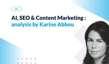
Explore SEO 2025 trends and discover how to adapt your content strategy to the age of generative AI with Karine Abbou's analysis.
Content lifecycle management covers all stages from creation to deletion. Learn how different content types, like white papers and videos, follow unique processes for each phase.
Content architecture is key to efficient content management systems. Learn how it enhances engagement, scalability, and drives success. Read the full article to know more.
Learn how to make a website accessible with best practices and features. Discover 10 ways to enhance web accessibility and create an inclusive online experience for everyone.
Discover the strategies, project phasing and main benefits of a successful CMS replatforming project. Reducing the number of legacy CMS platforms provides huge benefits to large organizations.
Learn about software security types and examples, and discover 5 best practices for securing your CMS, protecting sensitive data, and preventing cyberattacks.
Looking for an alternative to AEM (Adobe Experience Manager)? Here is a quick summary describing the tech behind Jahia.
So we went along to the Gartner Symposium, to get the analyst's latest technology recommendations. The topic at the heart of the debate? AI.
Choosing the best multilingual CMS is not an easy thing to do. So here is a list of checks to make before making you choice. Jahia CMS offers advanced features for managing multiple languages and is used by international businesses and NGOs to serve websites in several dozen languages.
We've gathered the words of experts to offer you a relevant approach to integrating AI into your CMS.
CMS security is vital to secure your content management system, protect business data, and defend against cyber threats. Read the blog to learn how to safeguard your business.
Spring framework is great.. but it cannot be used when building a CMS. Learn why.
Digital Asset Management (DAM) integrations enhance your CMS platform. Learn how using integrations can streamline workflows, boost efficiency, and improve team collaboration.
For Java Developers: what you should really look into when evaluating a headless Java CMS.
Adopting an omnichannel strategy relies on well-integrated tools that enable fluid content and data management. Jahia combines a flexible CMS, a Customer Data Platform (CDP), and bi-directional connectors for a unified, scalable experience, offering a balanced alternative between software suite and modular stack.
Jahia’s portal management system is built on the open source, digital experience (DXP) platform. This headless CMS environment makes managing portals simple.
Avec la version 8.2 de Jahia, le marché des CMS et DXP voit arriver une solution pensée à la fois pour les développeurs et les contributeurs.
Discover the tracking and monitoring possibilities available in a cloud-hosted CMS, and the role of monitoring in optimized performance and user experience management.
Identify the essential skills you need to recruit for a successful web project: digital strategy, UX/UI design, content & SEO, security... But above all, web development.
63% of digital marketers report that they struggle with personalization (Gartner). In this post, I’ll walk you through how to achieve meaningful personalization at scale.
A Content Management System (CMS) can be used in headless or traditional mode. In our article that explains how these two modes work, you will discover the limitations of each method depending on the structure of your company.
Discover the actions to put in place to personalize your web content according to your visitors' needs.
Learn all the basic best practices to optimize your internal search engine.
Digital Experience: Transform your website into an interactive, personalized tool. Give your users a unique experience thanks to your CMS.
With the Foundational Technical Review, Jahia Solutions takes another step forward in its collaboration with Amazon Web Services, and reaffirms its security commitments.
When it comes to website performance and optimization, the weight or size of images is what comes most naturally to mind: the lighter the images, the faster your pages will load, the better your users' browsing experience will be, and your search engine positioning with it. Our partner Scaleflex, which offers a specialized solution on the subject, has agreed to give us a few pointers to help you optimize your website's performance.
Jahia is based on a framework that enables organizations to create sites optimized for technical SEO. Our partnership with Semji gives you access to a powerful tool for boosting your semantic SEO.
The Keepeek DAM is now part of the Jahia digital ecosystem: a high-performance solution that will make it even easier to manage content in your CMS.
In this post, we’ll examine what an open source CMS is, how it works, and who can benefit from the software the most.
From the Intranet to the extranet, the web portal has established itself as a leading online tool for companies in all sectors. But it's not always easy to define exactly what this term means.
Self-service web portals are adopted by more and more companies. But what exactly is a self-service portal, and what are the key elements to consider before launching your strategy?
Discover key criteria for choosing a portal platform and explore essential features like compatibility, scalability, customization, and security.
The complete guide with every detail you need to know about DXPs (clear definition of the capabilities and components, how marketers and developers use it)
When contributing web pages, editors have to create links to other pages of interest for the visitors, use or reference contents which have been created in different locations on the site, add images coming from the DAM, etc. For all of these tasks, they need to go through a “picker” interface, so they can select the desired resources. Jahia provides a set of such pickers out-of-the-box, which are generic enough to address the most common use cases. But did you know that you can customize them to ease the content reference selection for your contributors?
Help your customers in the best way by identifying their business needs and what kind of contributions the CMS will have to support.
Discover how a french employment agency for executives managed to harmonize its digital environment thanks to a unique CMS developed in Java.
Evaluate the compliance with security standards of your Cloud CMS by analysing the processes, standards, and objective third-party evaluation.
Discover the different steps to migrate a Jahia software on the Cloud.
Headless vs traditional CMS: understand key differences, business impact, and get a feature checklist to test during your POC.
Discover the 5 steps to set up a site factory and anticipate the functional needs of your future content contributors.
You are having trouble achieving your organic traffic goals? It might be time to review your SEO techniques! Discover 5 ways to boost your SEO performance.
Discover how to migrate your Jahia software to Version 8 and get access to our new features.
Discover how Contentsquare’s accessibility module can be deployed on Jahia sites, letting visitors adjust the website’s appearance to fit their needs.
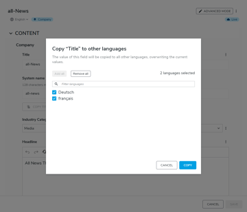
Discover Jahia's UI new features and how to get the most out of your user interface to adapt it according to your contributors' needs.
Discover how a leading social housing entity manages their customer data by creating their unparalleled client extranet and intuitive website.
How web portals in java help you integrate digital experiences across different touchpoints to give your customers both personalization and consistency
Running Apache Tomcat is an effective way to run a java based, open-source content management system (CMS), and create dynamic content for your readers.
There’s no doubt that CX matters, but it takes truly understanding your customers to make it happen. A structured approach can make all the difference. Let’s take a look at how to use personas, customer journey maps, and content audits to level up your CX.
Running a Headless CMS in a PaaS environment is the perfect scalable, cloud-based solution for hosting your content. Jahia’s jContent and Headless CMS solutions combine the best of both.
Whether you are just starting your website personalization journey or looking for a tune-up, these 5 best practices for website personalization will help improve your marketing efforts.
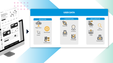
Too often, the conversation about customer data is focused on how it can service content, rather than how it can better serve the long-term goals of your organization. When used effectively, customer data empowers efficient user journeys and strong customer relationships.
In this post, we’ll examine the benefits of using a CDP and share our list of the 10 best customer data platforms available today.
With Apple & Google closing up shop when it comes to third-party cookies, the martech space is in flux - but building strong consumer-brand relationships starts with first-party data.
In this CDP vs DMP comparison, we’ll analyze the key differences between the two platforms to see which is more useful to your business.
In this post, we’ll examine the most popular customer data platform use cases and how they can benefit your business.
In this post, we’ll examine how your organization can benefit from an open source digital experience platform and what to consider when choosing a solution.
In this article, we take a look at 5 of the top reasons why integrating a DAM/PIM with a DXP leads to more engaging Customer Experiences.
CDP data assemble! A CDP is built very much like a news team. It consists of multiple different data types and delivery vehicles. When combined, they become a powerful team.
If data is the new gold, then consider the rush well and truly underway.
To deliver a modern customer experience, only a joint Marketing & IT strategy will suffice.
Jahia Solutions is an amazing company that I have had the privilege of being a part of for the last year. We have embarked on the journey many other companies have, the pursuit of a design system. This is my take on our journey so far.
2020 was a huge struggle for individuals and businesses, but it did also bring progress, as it transformed work-life balance into work-life blended.
A company's digital presence is as an integral part of the customer journey and overall business success. From your website to your social media to the very product you sell, every digital channel in which you “touch” your customers is part of their overall Digital Experience (DX). To make planning your digital experience stack simpler, we’ve created a 10 step DXS checklist to help you make the right stack choices.
The term “DXP,” or Digital Experience Platform, is tossed out by a lot of companies nowadays. But what exactly defines a DXP can be unclear.
If you're a B2B marketer, you have a lot of things to worry about. At the top of that list, is generating leads and pipeline for your organization.
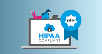
Jahia is officially HIPAA compliant! Carefully manage PHI within the Jahia DXP.
Digital strategies ultimately guide how your organization builds out its technology, adapts to changes in the market, and builds a sustainable engine that delivers real ROI for your digital marketing and organizational efforts.
Whether you’re in the process of buying a DXP or just on the hunt for more information, we’re here to explain the cost difference between the suite and stack approach.
It’s that age-old dilemma: Cheese vs. quiche. Apples vs. pie. CMS vs. DXP.
Have you ever heard the phrase “Content is King?” Well, if you’re a marketer or IT professional, this isn’t just an overused idiom – you are literally servant, maid and serf to the content that your organization produces on a daily basis.
t’s a question that’s dogged the technology world for decades. The crux of this debate revolves on whether it’s better to enshrine your marketing technology in the walled-garden of a single Tech Giant or entrust it to the wild west of smaller, more agile Challenger Tech companies.
Jahia’s latest update is built to adhere to the iterative mindset. Instead of going for the big fireworks display that often accompanies a flashy acquisition or new piece of software, we took a step back and answered three key questions.
At Jahia, we are committed to making digital simpler. To that end, we decided to run an experiment: Could an agency with no prior experience with Jahia create a new web app within 2 weeks, utilizing Jahia's Content & Media Manager as a headless CMS? This is 1st part of that story
Alex and Lars have developed content definitions and are ready to start linking the app. Will they make the 2 week timeline? Find out in the 2nd part of their story!
CDPs, or Customer Data Platforms, have recently become a hot-button topic of conversation. Mentioned usually, but not always, in the same breath as DXPs. Now, while we wouldn’t necessarily say that it’s incorrect to pair these two together, it is important to know that DXPs and CDPs are not the same thing.
We’re going to take a break from Headless this week to talk about something near and dear to our hearts – Customer Satisfaction. As in, how satisfied are our current Jahia customers with our performance, our product, and the work we are doing to deliver the best possible customer experience solution on the market? You might also know this as “NPS,” or Net Promoter Score.
It’s our slogan. Our motto. Our raison d'être. “Making Digital Simpler” defines the very essence of what Jahia is and what we do, and as such has been a regularly-featured phrase on our products, our websites, our tchotchkes, and even the banners we take with us to tradeshows. But what does it mean?
As a leading multi-asset provider in all these competitive international markets, BNP Paribas Securities Services needs to effectively stand out. This all starts with their website, the entry point for many of their prospects.
A new year means new changes. Unlike our commitment to hot yoga, though, these changes are exciting in a way that won’t leave you gasping for breath afterwards. Let us tell you a bit about them:
The permanent monitoring of a Digital Experience Platform is necessary to follow the activity and detect problems as soon as they appear in order to have the opportunity to solve them.
In this post, we will give a little context about the notion of headless CMS, and then illustrate how Jahia’s Digital Experience Manager (DX) and Marketing Factory products can already be used as Headless products.
How to ensure content integrity; read our technical blog to get the latest information and full insight about Jahia technologies.
In Jahia, there are three main ways to work with properties: OSGi Configuration, Spring Configuration, and Site Settings.
Performance: sizing the Jackrabbit bundle cache properly. Read our technical blog to get the latest information and full insight about Jahia technologies.
Jahia's Blog - People and Passion: Driving Together for DX Performance. Click to read our post.
Jahia's Blog - More Insights About User Experience Design And Development. Click to read our post.
Make no mistake - digital marketing in today’s omni-everything market is as challenging as it is promising. Marketing funnels are now swipes. Business happens globally on a 24/7/365 (at all hours) basis. Customers expect personalized, relevant content in the way they are searching for it - on their preferred devices (which may change), real-time and geographically appropriate.
Jahia's Blog - On Driving Digital Leadership: The Disruptor CMO. Click to read our post.
Digital marketing has evolved; we are now in the seventh generation. No longer is digital marketing a matter of web content management systems or even web experience management with basic analytics. Today’s savvy leaders in digital enterprise know that it is about managing the entire set of interactions a customer has over the course of their lifespan with a brand.
Jahia's Blog - Let Customers Decide in a Push Me, Pull Me World. Click to read our post.
Jahia's Blog - Putting the Social In CIO. Click to read our post.
Polymer elements may be used in Jahia component views to help build powerful user interfaces for the content.
In 2013, should you double your resolutions? Read our technical blog to get the latest information and full insight about Jahia technologies.
Extending Jahia's REST API with Spring annotated controllers. Read our technical blog to get the latest information and full insight about Jahia technologies.
Publishing content across multiple formats is no small feat, and I will quickly go over the difficulties and review some possible solutions to help improve the situation.
How often does this happen to you ? You are on the go, you need to check out a web site of a public administration or a company because you need information only available from them directly. You use your mobile phone to browse the site as this is what you have with you, only to discover that the site in question is a mobile version and has only a partial copy of the information available on the desktop site.
Fighting spam with our Jahia Akismet integration module. Read our technical blog to get latest the information and full insight about Jahia technologies.
Introducing Jahia OSGi modules. Read our technical blog to get the latest information and full insight about Jahia technologies.
In 2013, should you double your resolutions? Read our technical blog to get the latest information and full insight about Jahia technologies.
Innovative open source software. Read our technical blog to get the latest information and full insight about Jahia technologies.
When one thinks about digitization, one immediately imagines large scanners, volume processing devices and other high end and non portable equipment. But just as mobile devices have revolutionized other fields, digitization may also benefit from highly portable computers such as smart phones.
Nowadays, especially with an on-going global economic crisis, companies are under a lot of pressure to reduce costs, and hope to do so with the many services available in the cloud: such as Facebook, Dropbox, or Amazon EC2. But is it really a good idea to go into the cloud blindly, sacrificing control over your own data ?
Whether you’re a Facebook user, a Twitter user or simply a collaborator using an intranet social network, you are now required to manage your online reputation.
The iPhone 5 is mostly an evolutionary release from a content provider point of view, but it does has a few major changes that may have strong impacts in terms of development costs. In this post, we’ll analyse the most important ones and how they may be addressed.
Jahia utilizes YourKit Java Profiler to analyze web application performance. Jahia can help analyze your java thread dump.
Quick Mac tip: install Java 1.5 on OS X Lion. Read our technical blog to get the latest information and full insight about Jahia technologies.
Oshyn - "5 Things About Jahia 6.5". Read our technical blog to get the latest information and full insight about Jahia technologies.


.png?w=360)


.jpg?w=360)
.jpg?w=360)