IA agentique et gestion de contenus : ce que votre CMS doit prévoir en 2026
IA agentique vs IA générative : définition, cas d'usage en gestion de contenus et rôle du CMS pour gouverner des workflows IA. Le guide Jahia.
Décryptez les dernières tendances du marché, les bonnes pratiques CMS et DXP, et les évolutions technologiques pour guider votre stratégie digitale.
IA agentique vs IA générative : définition, cas d'usage en gestion de contenus et rôle du CMS pour gouverner des workflows IA. Le guide Jahia.
Bâtissez une stratégie de personnalisation de site web efficace : données first-party, segmentation, A/B testing et automatisation IA.
Définition, types, données, exemples B2B et étapes clés pour construire une stratégie de personnalisation de site web pertinente et mesurable.
1,15 Md€ d'amendes RGPD en 2025. Transferts hors UE, consentement, Cloud Act, découvrez les critères pour choisir un CMS conforme et souverain.
Vous cherchez une alternative à AEM (Adobe Experience Manager) ? Voici un bref résumé décrivant la technologie derrière Jahia.
Au Salon Souveraineté Numérique 2026 (Paris), Jahia intervient sur "Acheter souverain" et vous accueille stand C13 avec Efficy.
Headless ou Traditionnel ? Découvrez quel modèle convient le mieux à vos enjeux de performance, de coût et de SEO pour piloter votre stratégie digitale.
Jahia participe au CRM Day Efficy 2026 et animera un atelier dédié aux enjeux des portails clients, entre complexité IT, souveraineté et création de valeur.
Top 7 des alternatives Sitecore (2026) : 1. Jahia, 2. AEM, 3. Magnolia, 4. Contentful, 5. Umbraco, 6. Sitefinity, 7. Drupal. Comparez l’agilité, le CTP et...
Artemis II vient de quitter l'orbite terrestre. La NASA publie ses premières images depuis l'espace et via leur site Jahia.
Jahia rejoint la French Tech : souveraineté numérique, innovation française et développement international. Découvrez les enjeux de cette adhésion.
Enjeux SEO, cloud et sécurité. Découvrez comment réussir votre migration CMS, éviter les pertes de trafic et sécuriser votre portail et votre CMS.
Un aperçu des principales évolutions et améliorations de la plateforme Jahia.
Découvrez ce qu’est un site web dynamique, ses usages, ses limites et comment les architectures hybrides et les DXP optimisent l’expérience digitale.
Le rôle du développeur évolue : il devient un architecte qui guide l'IA, valide ses propositions et itère rapidement pour affiner le produit final.
Une plateforme XP unifie le contenu, les données et la personnalisation afin de simplifier le MarTech et d'offrir des expériences évolutives et performantes.
Choisissez un CMS multisite adapté : gouvernance, multilingue, intégrations, sécurité, évolutivité et gestion centralisée performante.
Découvrez comment la gestion de contenu dans le cloud offre aux équipes évolutivité, agilité et sécurité, et comment Jahia Cloud garantit performances et contrôle.
Découvrez ce qu'est un CMS Cloud et comment il transforme la gestion de contenu. Explorez ses avantages et apprenez à optimiser votre stratégie numérique pour l'avenir.
Gérez des dizaines de sites plus vite et à moindre coût grâce au CMS multisite : cohérence de marque, sécurité renforcée et déploiement rapide.
Le DAM centralise, organise et sécurise vos fichiers numériques, aidant les équipes à gagner du temps et à réduire les coûts.
Accélérer la croissance avec un CMS d'entreprise : vitesse, sécurité, multilingue, puissance de l'informatique dématérialisée et personnalisation illimitée.
Contenu lent, SEO faible, problèmes de scalabilité ? Découvrez comment un CMS d’entreprise peut transformer vos performances numériques.
80% des entreprises se trompent de CMS. Ne faites pas la même erreur : découvrez ce qu’elles auraient aimé savoir avant qu’il ne soit trop tard.
Découvrez les différences entre IaaS, PaaS et SaaS pour choisir le meilleur modèle de cloud pour votre entreprise, la flexibilité, le contrôle ou la simplicité.
Comment mesurer le ROI d’une plateforme d’expérience digitale et justifier son investissement : gains business, coûts cachés, KPIs et bénéfices à long terme.
Jetez un coup d'œil sous le capot de notre implémentation, et découvrez comment fonctionne Jahia avec l'hydratation des composants React en java.
Les portails clients évolutifs et personnalisés sont un gain de temps pour vos équipes, renforcent les relations clients et améliorent votre ROI.
Jahia, la DXP pensée pour l’assurance : CMS multisite, conforme RGPD/ACPR, CDP intégrée, personnalisation, API-first, interopérable et agile.
L’architecture en îlot allie performance, SEO et interactivité grâce au rendu statique et à l’hydratation ciblée.
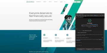
L’accessibilité web est un des grands enjeux du moment pour les institutions et les entreprises. Ce qui passe aussi par un CMS accessible.
Découvrez les bénéfices du portail client pour votre entreprise B2B : digitalisation des parcours d'achat et nouvelles attentes des acheteurs professionnels
Les intranets et les extranets sont des réseaux privés et sécurisés permettant de partager des informations et des documents d'entreprise avec des tiers.
La Responsabilité Sociétale des Entreprises (RSE) a pris un telle place qu'on parle aujourd'hui de gouvernance RSE. Le portail web peut devenir une brique stratégique de cette gouvernance.
Les CMS hybrides combinent le meilleur des CMS traditionnels et headless. Découvrez comment cette approche améliore la gestion de contenu.
Comment concevoir des sites web accessibles à grande échelle ? Voici quelques clés pour atteindre une conformité multisite.
Un DXP composable promet agilité et modularité, mais s'accompagne souvent de défis techniques et de gouvernance.
Découvrez les enjeux, méthodes et bonnes pratiques pour rendre votre site web accessible, durablement et simplement.
Le test d'accessibilité de vos sites web est généralement la première étape avant de mettre en marche un travail de mis en conformité. Voici 12 outils pour vous y aider.
CMS ou DXP ? Découvrez lequel répond le mieux à vos défis numériques et comment les combiner pour offrir des expériences web personnalisées à grande échelle.
1 Jahia, 2 Kentico, 3 Magnolia, 4 Adobe Experience Manager (AEM), 5 Sitecore, 6 Progress Sitefinity, 7 Drupal, 8 Joomla…
Découvrez comment choisir un DXP aligné avec vos objectifs, qui facilite la personnalisation, s’intègre facilement et évolue avec votre stratégie digitale.
Optimisez votre écosystème CX avec l'IA, la personnalisation, l’omnicanal et les données pour renforcer l’engagement et la fidélité.
Découvrez comment améliorer l'expérience client en ligne grâce à des stratégies efficaces. Apprenez à concevoir une stratégie de CX numérique qui améliore l'accessibilité et fidélise les clients.
Découvrez la différence entre DAM et GED. Apprenez comment ces outils rationalisent la gestion du contenu numérique pour organiser les actifs créatifs ou les documents commerciaux essentiels.
Découvrez la différence entre les sites statiques et dynamiques, leurs avantages et inconvénients, et comment notre solution DXP peut améliorer votre présence numérique.
Découvrez ce qu'est un site web Entreprise et explorez des exemples. Apprenez comment le développement de sites web Entreprise permet à votre entreprise de disposer d'outils pour rester compétitive et stimuler sa croissance.
Le contenu en tant que service (Content-as-a-Service - CaaS) aide les entreprises à fournir un contenu cohérent et personnalisé sur toutes les plateformes. Découvrez comment le CaaS peut améliorer votre gestion de contenu.
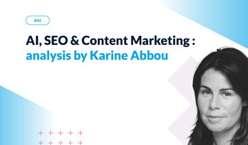
Explorez les tendances SEO 2025 et découvrez comment adapter votre stratégie de contenu à l’ère de l’IA générative grâce aux analyses de Karine Abbou.
La gestion du cycle de vie du contenu couvre toutes les étapes, de la création à la suppression. Découvrez comment les différents types de contenu, tels que les livres blancs et les vidéos, suivent des processus uniques pour chaque phase.
L'architecture de contenu est la clé d'un système de gestion de contenu efficace. Découvrez comment elle améliore l'engagement, l'évolutivité et la réussite. Lire l'article complet pour en savoir plus.
Apprenez à rendre un site web accessible à l'aide de bonnes pratiques et de fonctionnalités. Découvrez 10 façons d'améliorer votre accessibilité web et de créer une expérience en ligne inclusive pour tous.
Fin 2024, la conférence d’ouverture de l’Intelligence Marketing Day, à Lyon, a pour thème : Tendances marketing et évolution des usages du numérique.
Découvrez les stratégies, les étapes et les principaux avantages d'un projet de replatforming CMS réussi. La réduction du nombre de plates-formes CMS existantes présente d'énormes avantages pour les grandes organisations.
Découvrez les types et les exemples de sécurité logicielle, ainsi que les 5 meilleures pratiques pour sécuriser votre CMS, protéger les données sensibles et prévenir les cyberattaques.
Nous nous sommes donc rendus au Symposium Gartner, afin d’obtenir les dernières recommandations technologiques de l’analyste. Le sujet au cœur des débats ? L’IA.
Choisir le meilleur CMS multilingue n'est pas simple. Voici donc une liste de vérifications à effectuer avant de faire votre choix. Le CMS Jahia offre des fonctionnalités avancées pour la gestion de plusieurs langues et est utilisé par des entreprises internationales et des ONG pour servir des sites web dans plusieurs dizaines de langues.
Nous avons recueilli les paroles d’experts afin de vous proposer une approche pertinente pour intégrer l'IA à votre CMS.
La sécurité des sites web est essentielle pour sécuriser votre système de gestion de contenu, protéger les données de l'entreprise et se défendre contre les cybermenaces. Lisez cet article pour savoir comment protéger votre entreprise.
Spring est puissant mais limité pour les CMS modulaires. OSGi offre une meilleure isolation et flexibilité pour gérer plugins et extensions Java.
Les intégrations d'outils de Digital Asset Management (DAM) améliorent votre plateforme CMS. Découvrez comment l'utilisation d'intégrations peut rationaliser les flux de travail, augmenter l'efficacité et améliorer la collaboration au sein de l'équipe.
Pour les développeurs Java : ce qu'il faut vraiment regarder lors de l'évaluation d'un headless Java CMS.
Adopter une stratégie omnicanale repose sur des outils bien intégrés qui permettent une gestion fluide du contenu et des données. Jahia combine un CMS flexible, une Customer Data Platform (CDP), et des connecteurs bidirectionnels pour une expérience unifiée et évolutive, offrant ainsi une alternative équilibrée entre la suite logicielle et la stack modulaire.
Développez des sites web en JavaScript avec Jahia : modules React, rendu hybride et meilleures performances pour créer des expériences front-end modernes.
Migrer vers un CMS cloud exige préparation: nettoyer les données, vérifier la compatibilité et gérer les logs pour garantir performance et conformité.
Quels sont les enjeux spécifiques de la gestion de portails web ? Et comment aller encore plus loin dans l'utilisation de votre portail ? C'est ce que nous vous proposons d'explorer dans cet article.
Avec la version 8.2 de Jahia, le marché des CMS et DXP voit arriver une solution pensée à la fois pour les développeurs et les contributeurs.
Découvrez les possibilités de suivi et de surveillance disponibles dans un CMS hébergé sur le Cloud, et le rôle du monitoring dans une gestion optimisée de la performance et de l'expérience utilisateur.
Identifiez les compétences essentielles à recruter pour réussir un projet web : stratégie digitale, UX/UI design, contenu & SEO, sécurité... Mais surtout développement web.
Dans cet article, je vais vous expliquer comment réaliser une personnalisation pertinente à grande échelle.
Le CMS headless offre flexibilité et omnicanal, mais reste complexe et peu adapté au web SEO ; le CMS hybride combine ses avantages avec plus d’équilibre.
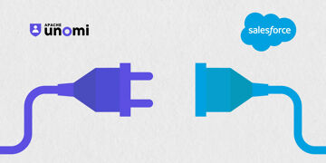
Avec l'intégration Salesforce, les entreprises peuvent synchroniser les données de leur CRM avec les données récoltées sur leur site web, dans un sens comme dans l'autre. On vous explique comment.
Découvrez les actions à mettre en place pour personnaliser votre contenu web en fonction des besoins de vos visiteurs.
Apprenez toutes les bonnes pratiques de base pour optimiser votre moteur de recherche interne.
Digital Experience: Transform your website into an interactive, personalized tool. Give your users a unique experience thanks to your CMS.
Avec la certification Foundational Technical Review, Jahia Solutions franchit une nouvelle étape dans sa collaboration avec Amazon Web Services, et réaffirme ses engagements en matière de sécurité.
Quand on parle des performances d'un site web et d’optimisation, le poids ou la taille des images est ce qui vient le plus naturellement à l’esprit : moins les images sont lourdes, plus rapide sera le chargement de vos pages, meilleure sera l’expérience de navigation de vos utilisateurs, et votre positionnement sur les moteurs de recherche avec. Notre partenaire Scaleflex, qui propose une solution spécialisée sur le sujet, a accepté de nous donner quelques éléments pour vous aider à optimiser les performances de votre site internet.
Jahia permet de créer des sites web optimisés SEO, et avec Semji, renforcez vos performances en référencement sémantique.
Le DAM Keepeek fait désormais partie de l'écosystème digital de Jahia : une solution performante qui facilitera encore plus la gestion des contenus dans votre CMS.
Dans cet article, nous examinerons ce qu'est un CMS open source, comment il fonctionne et qui peut en tirer le meilleur parti.
De l'intranet à l'extranet, le portail web s'est imposé comme un outil en ligne de premier plan pour les entreprises de tous les secteurs. Mais il n'est pas toujours facile de définir exactement ce que ce terme recouvre.
Découvrez comment le portail fournisseurs modernise vos achats, réduit vos coûts et améliore vos relations prestataires | Fonctionnalités et idées d'utilisation
Le Portail en libre service, ou portail self-service, offre une expérience simple, personnalisée, et actionnable en toute autonomie. Découvrez pourquoi et comment mettre en place le vôtre.
Découvrez les critères essentiels pour choisir une plateforme de portail et les fonctionnalités du portail nécessaires à son succès
Un CMS headless enterprise facilite le multisite : centralisation, scalabilité, multilingue et diffusion omnicanale pour une gestion efficace et cohérente.
CMS headless, hybride ou traditionnel : comparez avantages et limites pour choisir la solution adaptée à vos besoins et à votre maturité digitale.
Créez une DXP avec une UX optimale pour les métiers : templates, contenus structurés et outils adaptés pour améliorer autonomie, agilité et productivité.
Le guide complet pour mieux comprendre la DXP (définition des capacités et composants, comment les marketers et développeurs l’utilisent)
Jahia devient cloud first pour offrir performance, sécurité et simplicité, avec des fonctionnalités exclusives et une gestion facilitée des environnements.
Accompagnez au mieux vos clients en identifiant leurs besoins métier et quels genres de contributions le CMS va devoir supporter.
Découvrez comment l'acteur de référence sur le marché des compétences cadres est parvenu à harmoniser son environnement digital grâce à un CMS unique développé en Java.
Évaluez la conformité aux normes de sécurité de votre CMS dans le Cloud en analysant les processus, les normes et l'évaluation objective par un tiers.
Découvrez les différentes étapes de la migration d'un logiciel Jahia sur le Cloud.
CMS headless ou traditionnel ? Découvrez leurs différences pour les utilisateur métier et notre checklist des fonctionnalités clés à tester lors d'un POC.
Découvrez les 5 étapes pour mettre en place une usine à sites et anticiper les besoins fonctionnels de vos futurs contributeurs de contenu.
Vous n'arrivez pas à atteindre vos objectifs en matière de trafic organique ? Il est peut-être temps de revoir vos techniques SEO !
Découvrez comment appréhender la migration de votre logiciel Jahia vers la Version 8 est ainsi avoir accès à nos nouvelles fonctionnalités.
Découvrez comment le module d’accessibilité Contentsquare Accessibility développé et géré par Contentsquare peut être déployé sur les sites Jahia,
Découvrez les nouvelles fonctionnalités de l'UI Jahia, et comment pousser les possibilités techniques de votre interface utilisateur.
Découvrez comment un gestionnaire de logements a créé un site web et un extranet client intuitifs, et gère efficacement les données de milliers de locataires.
Comment les portails web en java vous aident à intégrer des expériences numériques à travers différents points de contact pour offrir à vos clients à la fois personnalisation et cohérence.
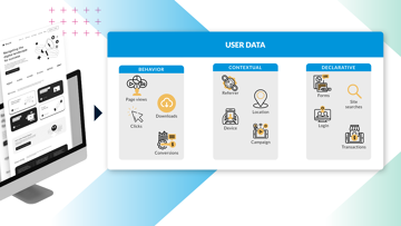
CDP et DMP stockent et gèrent des données, mais répondent à des usages différents. Découvrez leurs différences clés dans notre article comparatif.
De la collecte de données aux expériences optimisées, les plateformes de données clients offrent de nombreux cas d’usage à forte valeur pour l’entreprise.
Les DXP open source unifient données et contenu pour créer des expériences client à grande échelle. Découvrez comment elles peuvent accélérer votre croissance.
La plupart des entreprises veulent placer les données au cœur de leur activité pour renforcer leur stratégie et développer la relation client.
Petit rappel : votre stratégie digitale définit la façon dont votre organisation met en place sa technologie, s'adapte aux évolutions du marché et développe un moteur durable qui générera un véritable ROI pour vos efforts organisationnels et de marketing.
Vous avez déjà acheté une voiture d'occasion ? Eh bien le processus d'achat d'une plateforme d'expérience digitale, ou DXP, est très similaire. Vous voulez savoir pourquoi ?
Le monde Martech adore l'idée selon laquelle le choix entre CMS et DXP est une question déterminante pour toute organisation, mais en réalité ce débat est superficiel. Et voici pourquoi
Avez-vous déjà entendu l'expression "le contenu est roi" (content is kind en version originale) ? Si vous travaillez dans le marketing ou l'informatique, alors vous savez qu'il ne s'agit pas seulement d'une expression répétée à l'envi.
Stack Vs Suite : quelle est la meilleure approche pour votre organisation. Les caractéristiques d'une approche Best-of-Breed dans le Martech.
La dernière mise à jour de Jahia a été conçue dans cet état d'esprit itératif.
Selon Kissmetrics, 40% des internautes abandonnent un site Web qui prend plus de 3 secondes à charger. Un délai d'une seconde dans la réponse de la page peut entraîner une réduction de 7% des conversions. La vitesse compte vraiment. C'est pourquoi nous avons créé un module d'analyse de performances.
La surveillance permanente d’une DXP est nécessaire pour en connaître l’activité et détecter les problèmes dès leur apparition afin d’avoir la possibilité de les résoudre.
Choisir un outil d’optimisation web repose sur 7 critères clés : contenu, workflows, preview, intégrations, data et conversion, en SaaS ou intégré.
Dans le monde d'aujourd'hui, où les criminels essaient de détourner des sites Web et des sessions, de créer des dommages à l'aide de scripts nuisibles ou même avoir accès à des données sensibles, il est très important de réduire les risques en mettant en œuvre les contre-mesures disponibles. Le projet Open Web Application Security (OWASP) fournit de la documentation et des outils pour aider à sécuriser les sites Web ou à détecter les vulnérabilités.
La numérisation transforme le tourisme : adaptez vos stratégies digitales pour répondre aux attentes clients et rester compétitif dans un secteur en mutation.
Simplifiez l’authentification avec OAuth et le social login : améliorez l’expérience utilisateur, la sécurité et augmentez vos conversions.
Blog Jahia - New disruption in digital marketing landscape drives innovati on in Jahia brand experience. Lire notre post en anglais.
Blog Jahia - Disruption and Unification: The Emerging CMO's Focus. Lire notre post en anglais.


.png?w=360)


.jpg?w=360)
.jpg?w=360)